← Selected work · Fintech · Crypto wallet · Nigeria + Kenya
Mara Wallet: a crypto wallet for people who had never owned crypto
I was the only in-house product designer, and I worked on every screen, first with Mara’s own team and then with the contract team that joined later.
- Role
- Senior Product Designer, in-house
- Years
- From February 2022
- Markets
- Nigeria and Kenya
- This page
- Real screens from my working file, plus a 2026 prototype
The problem
People new to crypto were asked to trust an app with their money before they understood what it was doing, in markets where currencies, payment habits and regulation differ by country.
My role
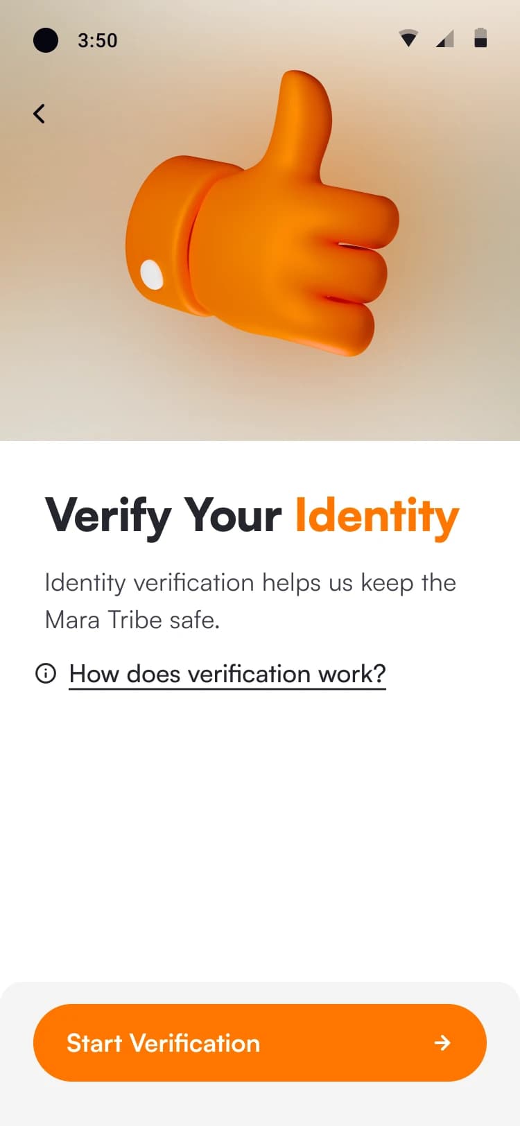
Senior Product Designer on Mara Wallet from February 2022: verification and consent, trade review and confirmation, deposits and withdrawals, activity, and the home screens for new and existing users.
The result
Two user states across 54 mobile screens, six design decisions explained, and a reimagined swap review you can use.
01 — The context
A wallet for a market new to crypto.
Mara, formerly CoinMara, was a pan-African crypto company. In May 2022 it announced $23 million in funding and its entry into Nigeria and Kenya.Public Source: Wikipedia, citing The Guardian Nigeria and TechCrunch (opens in a new tab).
Mara Wallet launched in stages, with Nigeria first, then Ghana and Kenya, because regulation differs by country. About three million people were on the waiting list before launch.Public Source: Infinum, 9 January 2023 (opens in a new tab).
The brief also meant designing for low-spec Android phones, unreliable connectivity and expensive mobile data.Public Source: Infinum’s case study (opens in a new tab).
That shaped every screen. The people arriving were new to crypto, the main currency was the naira, and each country had its own rules about who could do what. Every screen had to say what was happening, what it cost and what came next.Judgement
02 — My role
In-house from the start, on every screen.
I joined Mara in February 2022 and was the only in-house product designer.
Infinum, an outside product partner, worked on the product with Mara, and the people on its team changed over time. I worked with whoever was on the project, on every page, and kept the product direction consistent as the team changed.
The screens on this page come from my working file for Mara Wallet. The layouts are mine; the brand, product and company belong to Mara.
03 — The product
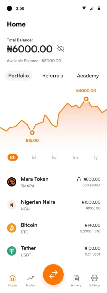
Two states, two homes.
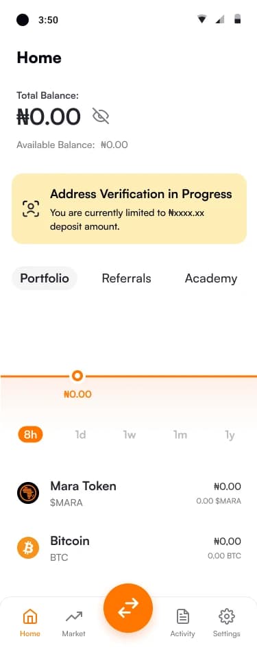
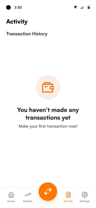
A new user and an existing user open different home screens. I designed both states, and the verification, deposit, withdrawal and activity screens around them. The exported set has 54 screens; these carry the decisions.Design-level
Getting started: a new user
Day to day: an existing user
04 — Design decisions
Six design calls.
- 01
Say what you can do while verification is pending.
Home carries a banner while identity or address verification is running. It says which check is in progress, that Mara will tell you when it finishes, and what limit applies meanwhile.Design-level
WhyVerification takes time. A blocking screen would stop people using the app at all; a banner keeps Home working and states the limit instead of hiding it.Judgement
CostThe banner competes with the balance for attention, and every verification stage needs its own wording and state.
- 02
Show the price, the fee and the total before the commitment, then be honest about the clock.
Review and Confirm shows what you will receive, what you pay with, the price, the fee included with an explainer, and the total spent. The confirm button carries a countdown.Design-level
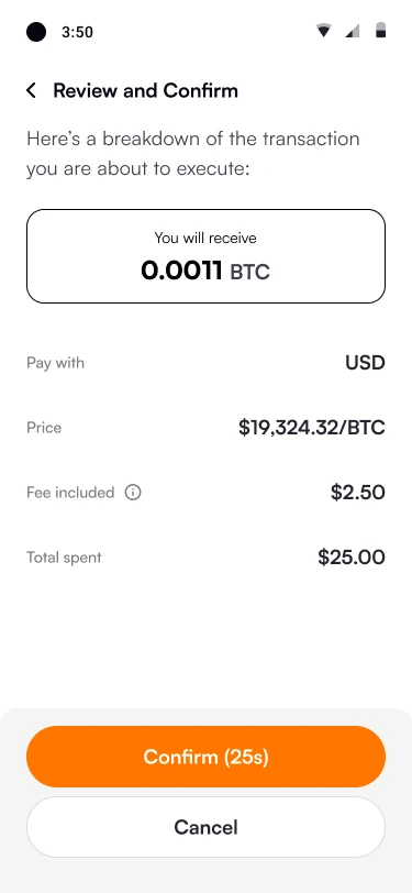
Buying: receive amount, price, fee included, total, and a Confirm button with a clock. 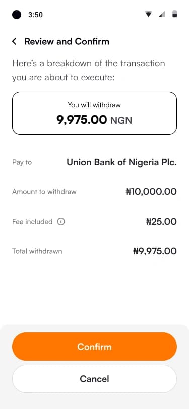
Withdrawing: the bank, the amount, the fee, and what arrives. WhyMoney moves at this step, so everything that changes the amount sits on one screen. A quote that changes needs a visible end.Judgement
CostA countdown adds pressure, and slow readers will meet an expired quote. This is the call I would revisit first; the prototype below shows how.
- 03
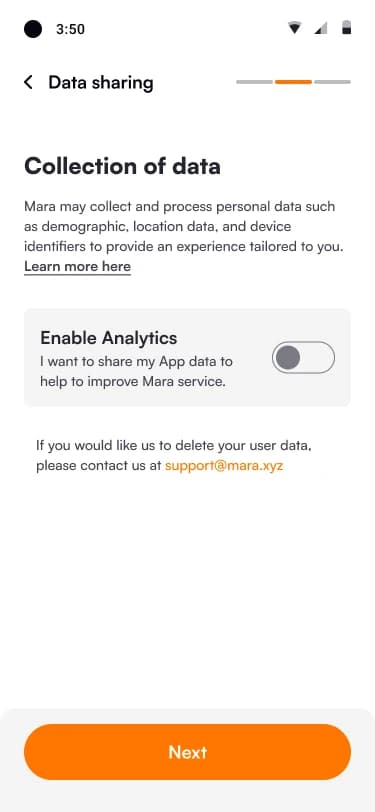
Ask for consent in plain words, as its own step.
Data sharing is one screen: a plain description of what is collected, one analytics switch, and a stated way to delete your data. I designed both switch states.Design-level
Switch off. 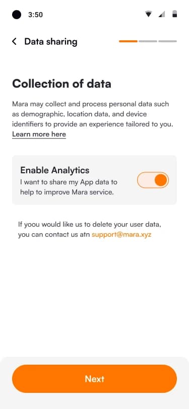
Switch on. WhyPeople new to crypto often have good reason to be careful with personal data. One choice on its own screen is easier to understand than a line in the terms.Judgement
CostOne more step before the app is usable, kept short with a three-step progress bar.
- 04
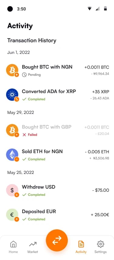
Name every state, and never rely on colour.
Activity groups transactions by date and gives each one a status in words and a mark: Pending, Completed, Failed. Failed rows are dimmed. Result screens say what happened and what to do next.Design-level
Status in words and a mark, not colour alone. 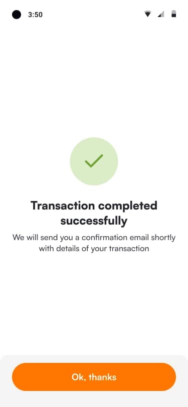
A result screen that says what happens next. WhyA pending or failed payment is where trust is won or lost. A word and a mark work for people who cannot tell the colours apart.Judgement
CostMore wording to maintain for every state, and for every language.
- 05
Give people a local way in and out.
Naira deposits can be made person to person. You confirm the amount, the app searches for a match, then confirms it. Withdrawals name the bank, the fee and what arrives.Design-level
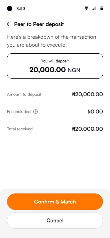
Review the deposit, then Confirm & Match. 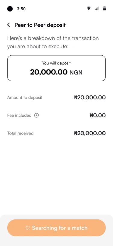
Searching for a match. 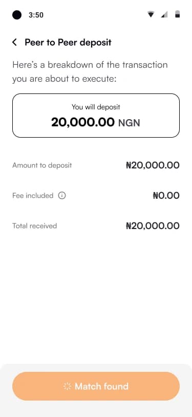
Match found. WhyA card is not the only way people want to fund a wallet. A person-to-person route needs its own states, so that waiting for a match never looks like a freeze.Judgement
CostMatching takes time, so the waiting states have to carry the trust.
- 06
Make waiting useful.
Home has Portfolio, Referrals and Academy tabs. Referrals shows your code, your place in the queue and your rewards. Academy holds short articles and videos.Design-level The figures in these screens are sample data from the design file.
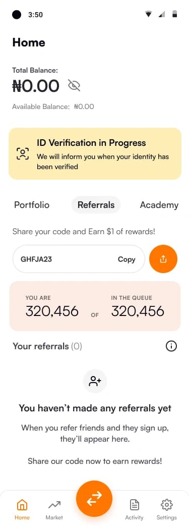
Referrals: your code, your place in the queue. 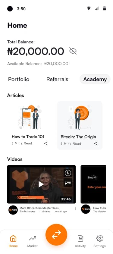
Academy: short articles and videos inside the app. WhyThe wallet opened in stages, and Infinum’s case study lists a waitlist with a referral system among its features, so a person could open the app before they could do much. A referral code and something to learn give that visit a purpose.Judgement
CostMore surfaces on Home, and a queue that has to stay honest or it loses trust.
05 — Reimagined 2026
Review and confirm, for a swap today.
Mara’s confirm step handled a buy. A swap on a decentralised exchange needs more of the truth on one screen: price impact, the minimum you will receive, the network fee and slippage. This prototype keeps the 25-second clock from the original and rebuilds the step around what I would now test.Judgement
Review and confirm
You will receive about
4,971.34 USDT
At least 4,921.63 USDT at 1% slippage
- You pay
- 1.5625 ETH
- Rate
- 1 ETH = 3,200.00 USDT
- Price impact
- 0.25%
- Service fee (0.30%)
- $15.00
- Network fee (estimate)
- $1.20
What am I paying for?
The service fee goes to the app. The network fee goes to the chain’s validators and changes with traffic. Price impact is how far your own order moves the price in the pool. Slippage is the most the price may move against you before the swap is cancelled instead of filled.
Pair
Order size
Slippage tolerance
Test a failure
- Try Large. The price impact turns on a warning and holds the button until you acknowledge it.
- Wait for the clock. At zero the quote expires and the button becomes “Refresh quote”: the price may have moved, and it tells you so.
- Fail it on purpose. The error says what did not happen (no fee, no balance change) and what to do next.
- Illustrative prices, fees and pool depth. No wallet connects. Nothing is sent.
06 — What I’d do today
Seven things a swap screen should say.
- Say who holds the keys, at the first step, in one sentence.
- Split the cost into what the app takes, what the network takes, and what your own order moves.
- Let a quote expire gracefully: refresh it and say how the price moved, instead of failing.
- Put price impact and slippage in plain words, with a hard stop for extreme cases.
- Say what did not happen when something fails: the balance, the fee, the funds.
- Give pending and failed states a next action and, for on-chain actions, a link to the explorer.
- Check the network and the address before the confirm step, not after it.
Judgement These are my calls today, not a description of what shipped at Mara.
07 — Outcome
What I can stand behind.
- Two user states across 54 exported mobile screens.Design-level
- Price, fee and total on the same screen before every confirmation.Design-level
- Every transaction state has a word as well as a mark.Design-level
- Mara Wallet launched in stages, Nigeria first, and was listed on Google Play and the Apple App Store. By February 2023 the company reported 4 million verified people on the waiting list.Public Sources: Nairametrics, 23 February 2023 (opens in a new tab) and Infinum (opens in a new tab). That is the company’s sign-up count, not downloads or active users, and not a result I am claiming.
I am not quoting onboarding or conversion numbers from my time at Mara, because I cannot evidence them. How I would validate the confirm step today: a five-person unmoderated test on “swap, then tell me what you paid and what you will get”, measuring completion, time on task and wrong answers.