← Selected work · 06 — B2B SaaS · Commerce
ProConnection: redesigning photography commerce from a UX audit
A UX audit and redesign of a photography e-commerce platform and its B2B member dashboard: what the old pages got wrong, what customers said, how competitors compared, and what changed on every page.
- Role
- Senior Product Designer, via Toptal
- Platform
- Responsive website and member dashboard
- Timeline
- 4 months
- Tools
- Figma, Adobe Suite, Zoom, Maze
The problem
A photography commerce platform with poor navigation, a cluttered interface, a long checkout and a single payment method, against competitors that were fast and flexible.
My role
Senior Product Designer on a Toptal client engagement: customer-review research, competitor analysis, persona, wireframes, a rated UX audit of every page, a design system and responsive high-fidelity screens.
The result
Every audited page was redesigned and marked against its old version; the work was handed to developers. I don’t have outcome metrics for this engagement, and this page doesn’t invent any.
Design process in this case study · 9 of 12 stages shown
How I work- Problem and opportunity
- Research
- Personas and journeys
- Structure and flows
- Ideation and wireframes
- Prototype and testing
- High fidelity and responsive
- Design system and style guide
- Design developer handoff

Jump to a section
01 — The brief
Make a photography platform simple and intuitive.
The client sells camera equipment and accessories to photographers, through a public storefront and a members’ platform. The brief was to revamp the platform, improve the UX and create a simple, intuitive interface.Public
Four goals came out of it: good interactions and a simple flow, reduced cognitive load, a better reputation in the marketplace, and an interface that meets users’ needs.
Deliverables: high-fidelity prototypes, a design system (components, styles, fonts, colours), an intuitive onboarding flow with easy customer management, and a fully functional admin dashboard.
02 — Research
Reviews first, competitors second, then one person.
Stage 1 · What customers already said
I started with the company’s value, goals and challenges, then collected its public customer reviews and read them for recurring complaints. This is secondary research: I did not interview customers for this stage.Design-level
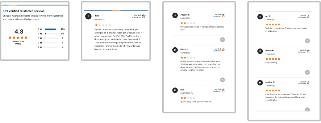
Recurring complaints
- Platform incompatible with various browsers
- Tracking isn’t available with the purchase
- Unable to find how to return the product
- Product photos in low resolution
- Shopping cart badge doesn’t update
- Navigating a cluttered interface
- The cash-out process is too long
- Difficulty with payment options
- Shipping and handling are costly
Stage 2 · How competitors compare
I compared the client with four established camera retailers on the things the reviews complained about.Design-level
| Criterion | ProMaster | Amazon | B&H | Canon | Nikon |
|---|---|---|---|---|---|
| Support | Email, telephone | Email, FAQ | Email, telephone, live chat | ||
| Navigation | Poor | Good | Good | Good | Good |
| Checkout process | Too long | Fast | Fast | Fast | Fast |
| Payment methods | One | Many | Many | Many | Many |
| Responsive | Yes | Yes | Yes | Yes | Yes |
The gap was specific: on navigation, checkout speed and payment choice the client was the outlier, and the other four were level with each other. Everyone was responsive, so “make it responsive” was not the problem to solve.Judgement
Stage 3 · One representative customer
To keep decisions anchored, I wrote one persona and an empathy map from the review themes. It is a representative persona built from reviews, not from interviews, and I label it as that.Judgement
Persona · representative
A professional photographer in Canada
32, Master’s in photography. Travels for work and buys camera gear online.
Goals
- Different payment options
- Works in every browser
- Good customer support
- Track my purchase
Frustrations
- Platform incompatible with various browsers
- Low-resolution product photos
- Navigating a cluttered interface
- Difficulty with payment options
- A poor mobile experience
User story: as a photographer I want to buy digital photography products online so I can get a discount and grow my skills.
Empathy map
- Thinks
- I wish I could track my orders. How can I return a product? Where is the dashboard?
- Feels
- Sad about the mobile experience. Annoyed by the cluttered interface and by having only one payment method. Happy with the organised product selection.
- Does
- Searches for a product, adds it to the cart, reaches out to customer service.
- Says
- The cash-out process is too long. Customer support was great. Shipping and handling are costly. No payment options other than PayPal.
03 — Problem statements
From “poor navigation” to what is actually wrong.
An audit label like “poor navigation” is a symptom. For the three problems that matter most, here is the version with the evidence behind it, the user it hurts and the measure it should move.
- 1 · Checkout
- The competitor table rates the client’s checkout “too long” while all four others are “fast”, and the reviews say the cash-out process is too long. A buyer who already knows what they want has to work through a long flow to pay. Measure: checkout completion rate, time from cart to payment. Design-level
- 2 · Payment choice
- One payment method against “many” everywhere else, and the reviews and empathy map both name payment problems and PayPal as the only option. Buyers who can’t pay the way they prefer leave at the last step. Measure: checkout abandonment, share of orders by payment method. Design-level
- 3 · Cart feedback and tracking
- The cart badge doesn’t update, there is no order tracking and returns are hard to find. A buyer can’t tell whether an action worked or what happened to a purchase. Measure: support contacts about order status and returns. Design-level
04 — Wireframes
Existing pages as the guide, heuristics as the rules.
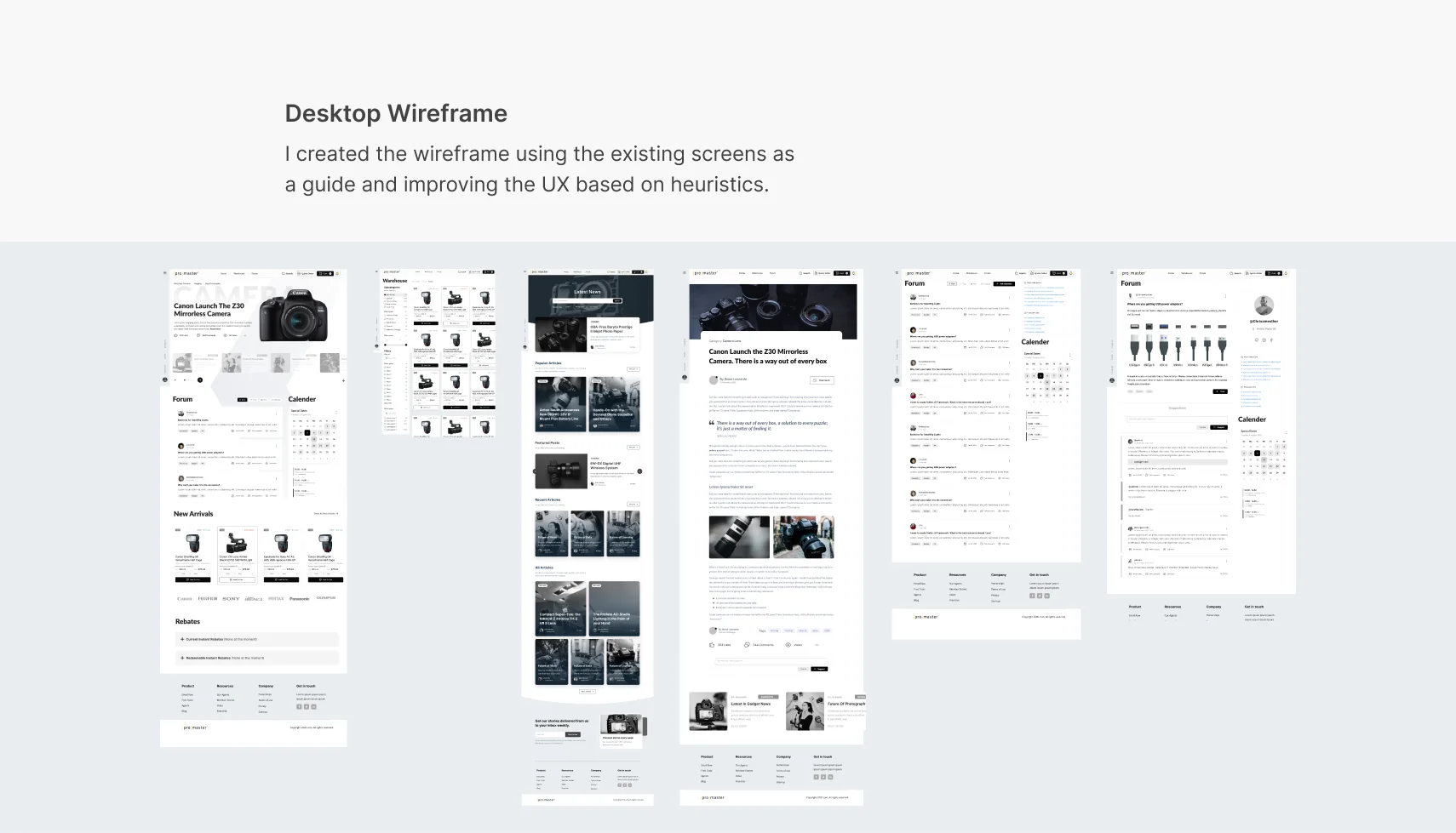
I built the wireframes from the existing screens, improving the layout against usability heuristics instead of starting from a blank page, so the client could compare old and new structure one to one.Design-level
05 — The audit
Old design, new design, every finding rated.
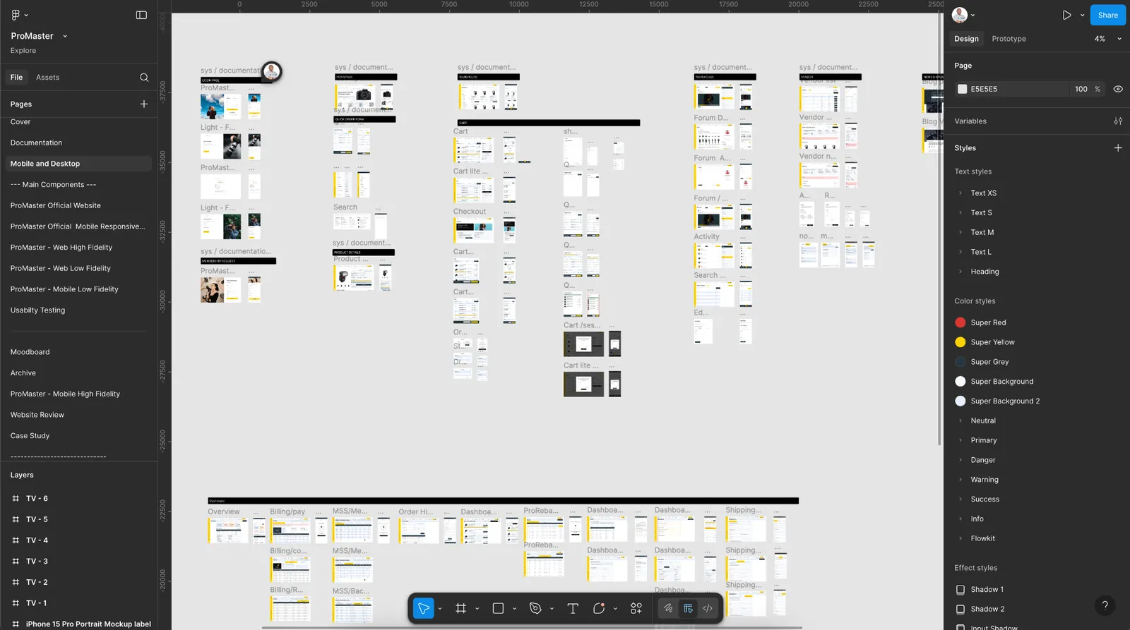
Each audit board sets the old page beside the new one. Findings on the old page are marked Needs to be fixed or Needs improvement; the matching change on the new page is marked Improved. This gave the client a page-by-page, auditable record of what changed and why.Design-level
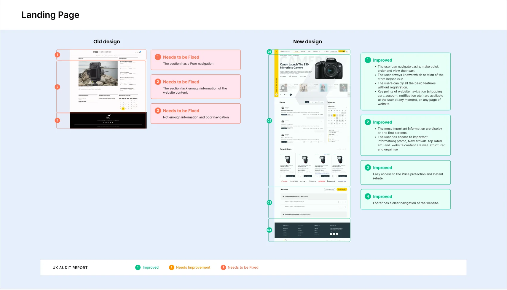
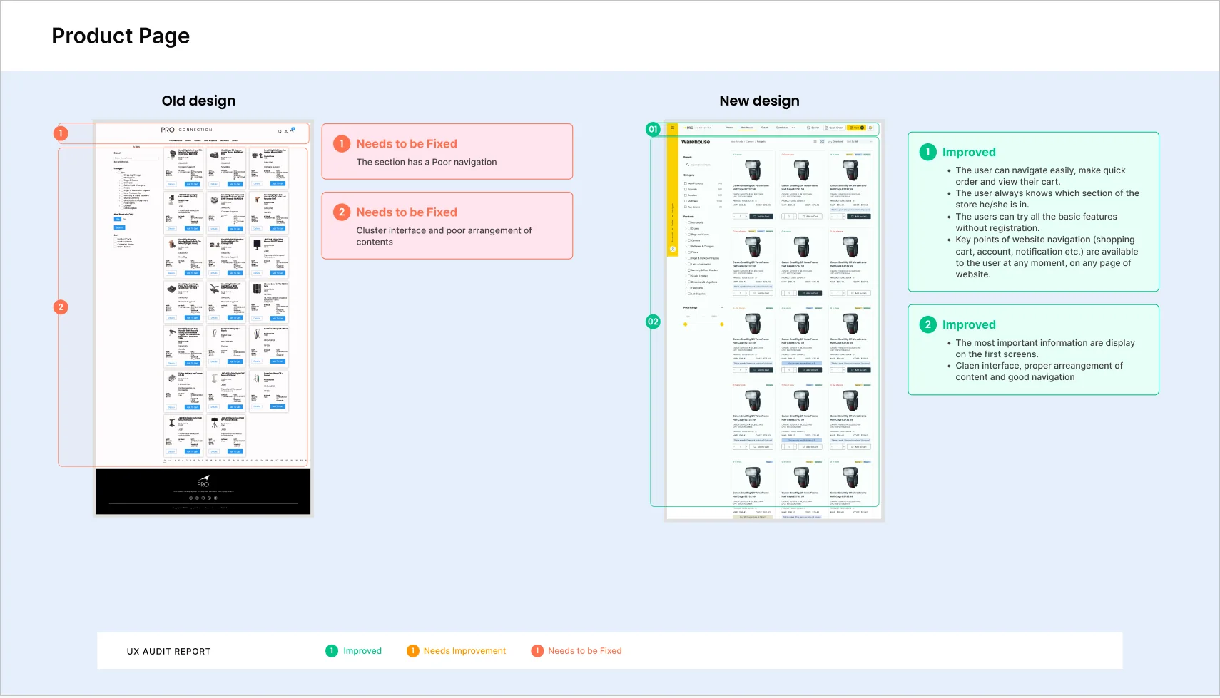
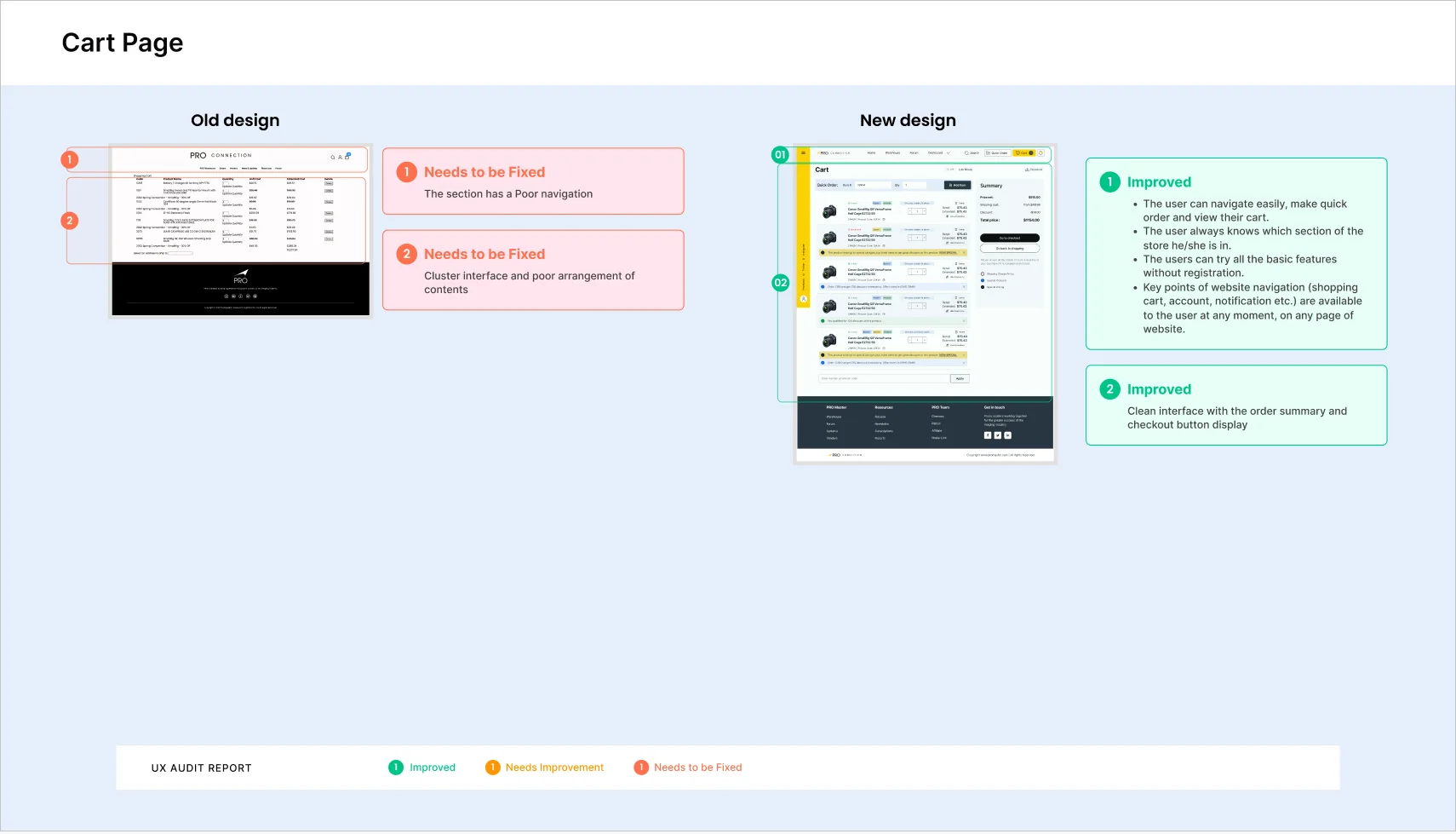
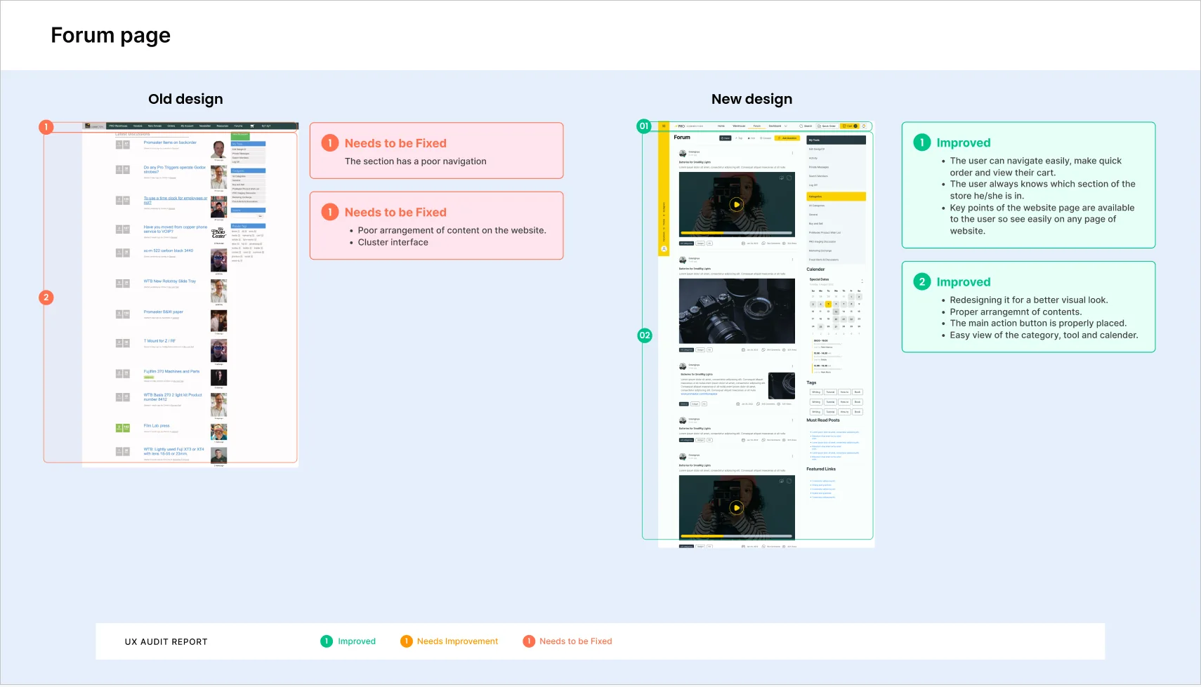
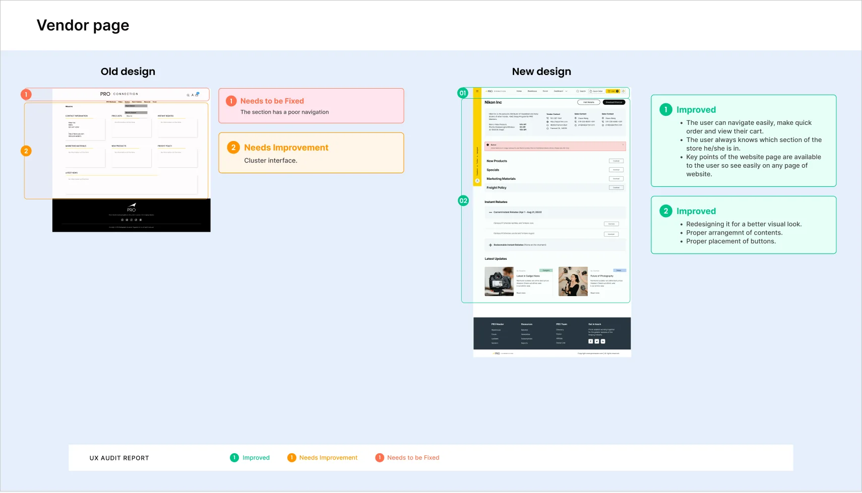
Honest note: the findings on these boards are short labels. The reasoning behind each page is in the deep dive below and in the evidence above, not on the boards themselves.
06 — Deep dive: cart and checkout
One page, followed from evidence to design.
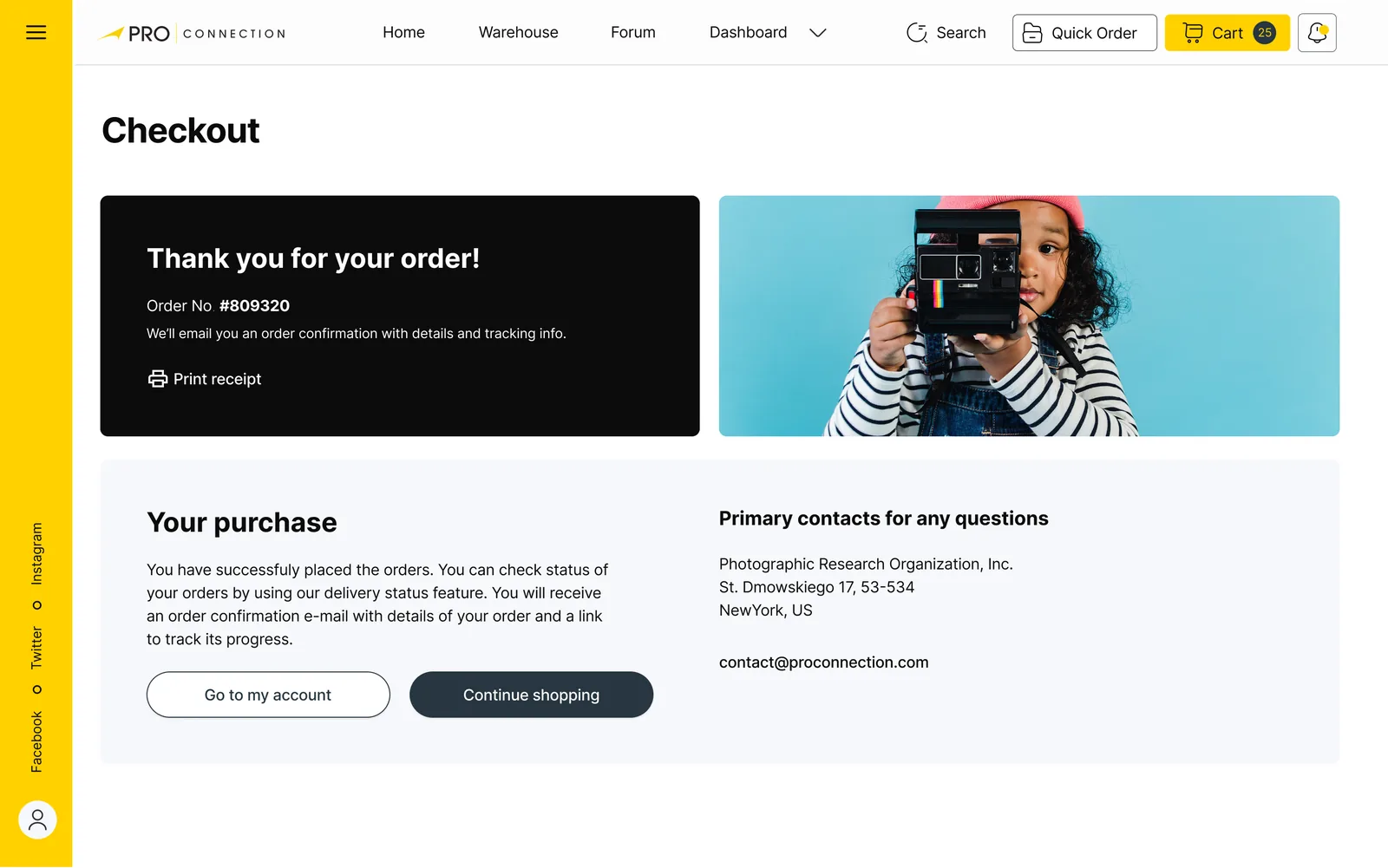
The cart is where several findings meet, so I trace it end to end instead of covering every page at the same depth. The screens below are the real designs.
- 01
The evidence
Reviews: the cash-out process is too long, payment options are limited, the cart badge doesn’t update. Competitors: checkout is “fast” everywhere else. Audit of the old cart: poor navigation, and a cluttered interface with poor arrangement of content.
- 02
Give the cart its own clear structure
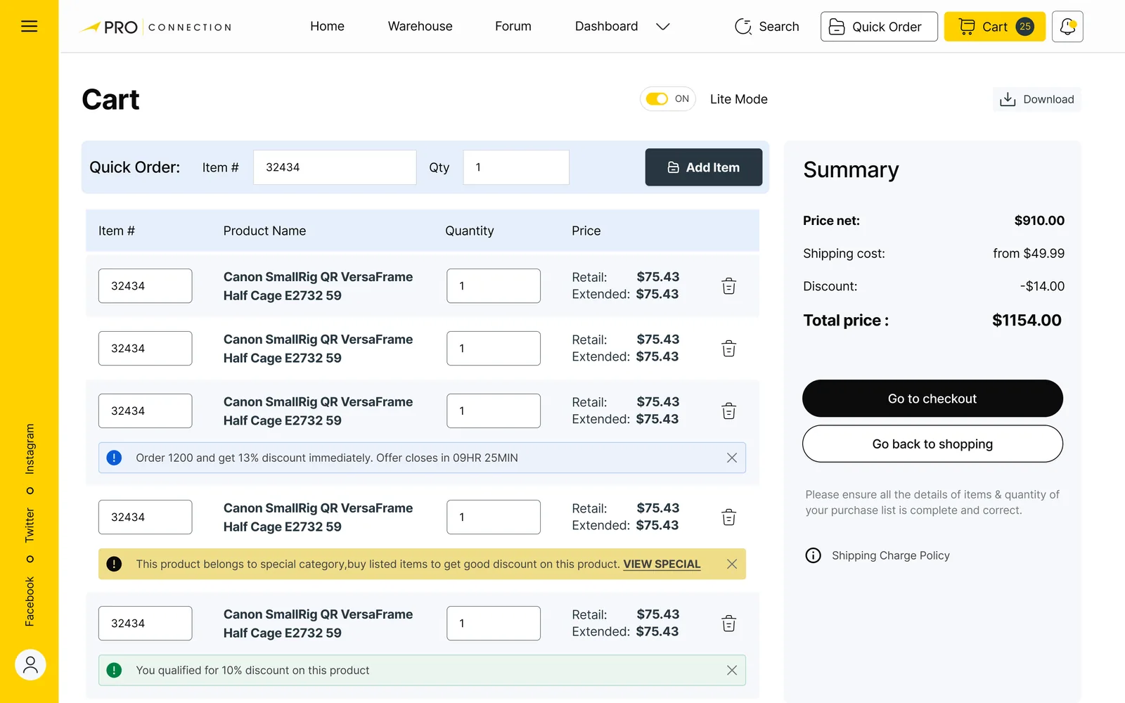
In the new design the cart is a line-item list with a summary panel beside it (products, shipping, discount, total) and a clear checkout button, instead of one dense table.
WhyA buyer should see what they owe and what to press next without hunting. The audit marks this “Improved: clean interface with the order summary and checkout button display”.Design-level
- 03
Make the main navigation always reachable
Search, cart, quick order and account sit in a header that is present on every page of the new design.
WhyIt answers “the section has poor navigation” directly and keeps the cart count in view, which the reviews said was missing.Design-level
- 04
Speed up repeat purchases, and don’t lose the cart
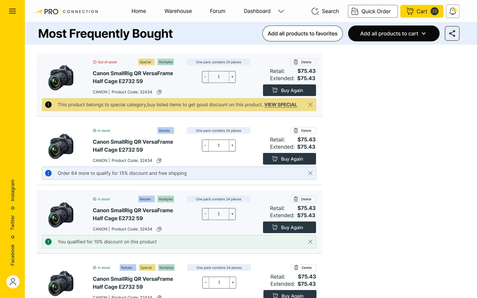
The new cart has a quick-order row (item number and quantity), a lite mode toggle for a compact table, and notices on line items when a quantity qualifies for a discount or an offer is closing.
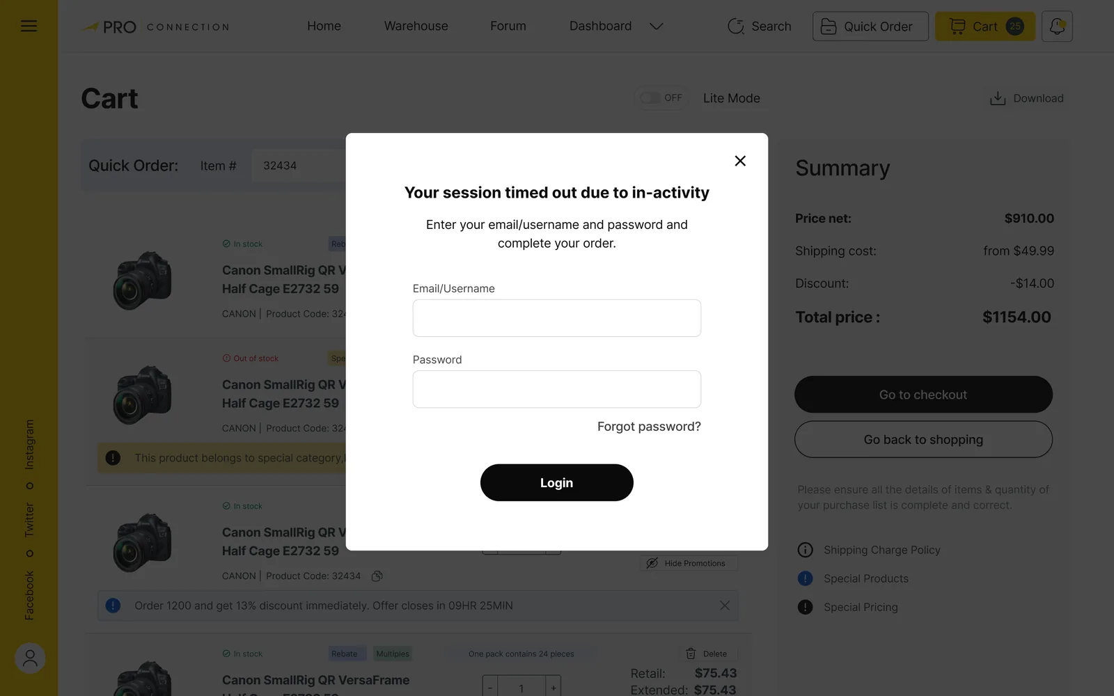
WhyPhotographers who know their SKUs shouldn’t need to browse again, and surfacing a discount at the point of purchase serves the persona’s goal of getting a discount. If the session times out, a dialog lets the buyer log in and complete the order with the cart still behind it.Judgement
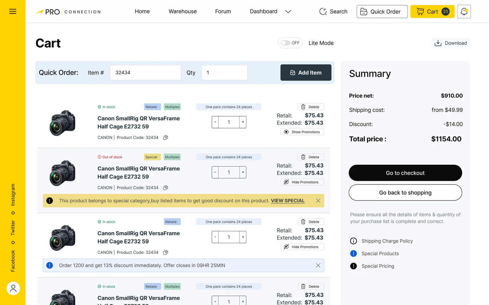
What I can’t show here: a measured change in checkout completion. I don’t have that data, so none is claimed. How I would test it: a moderated task test on “add three items and pay”, comparing steps and time on the old and new cart.
07 — The member dashboard
Money, statements and exceptions for working buyers.
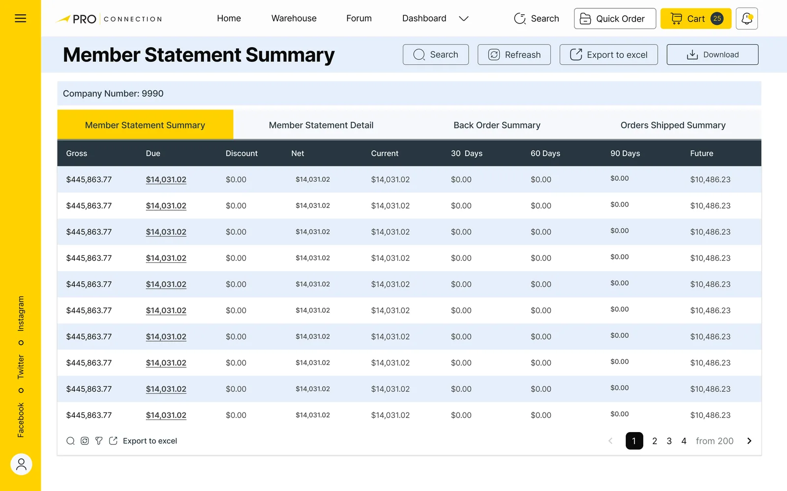
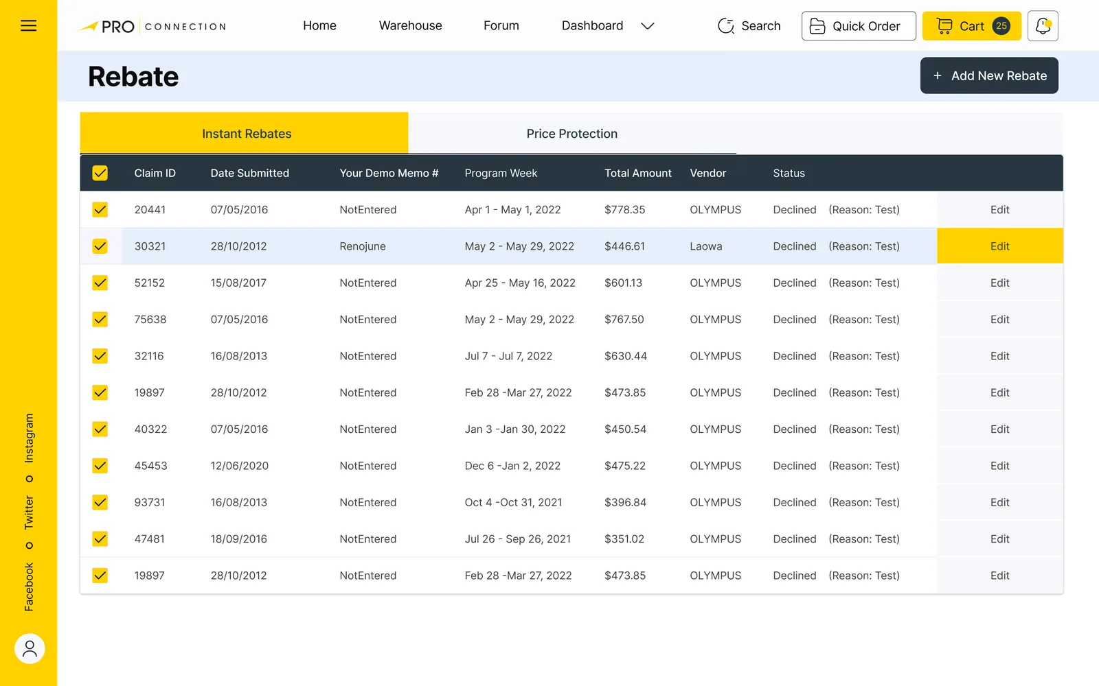
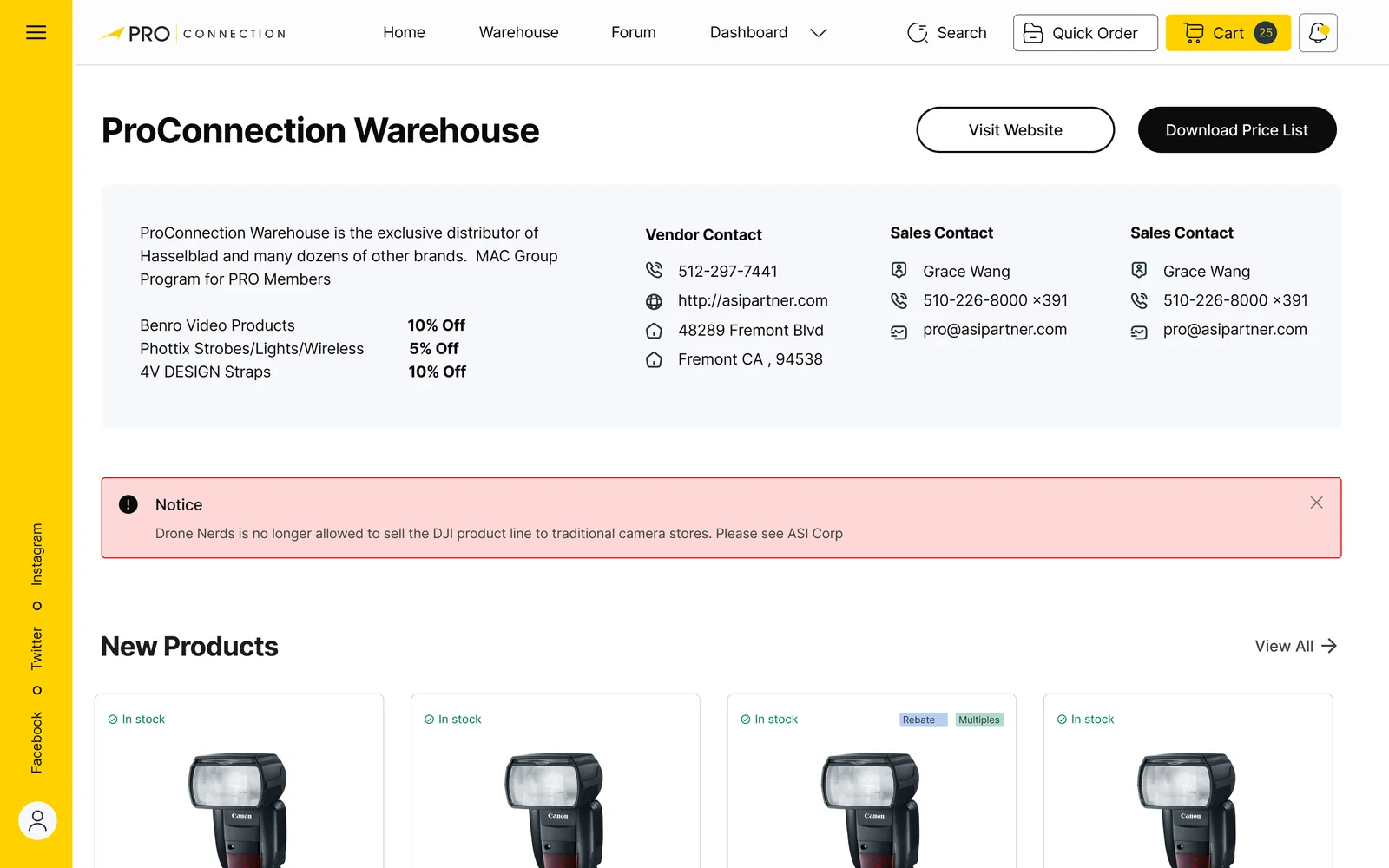
Members are businesses, so the dashboard is where they pay invoices, check statements, claim rebates and report problems. These are screens from that part of the system. Figures in them are placeholder data.Design-level
- 01
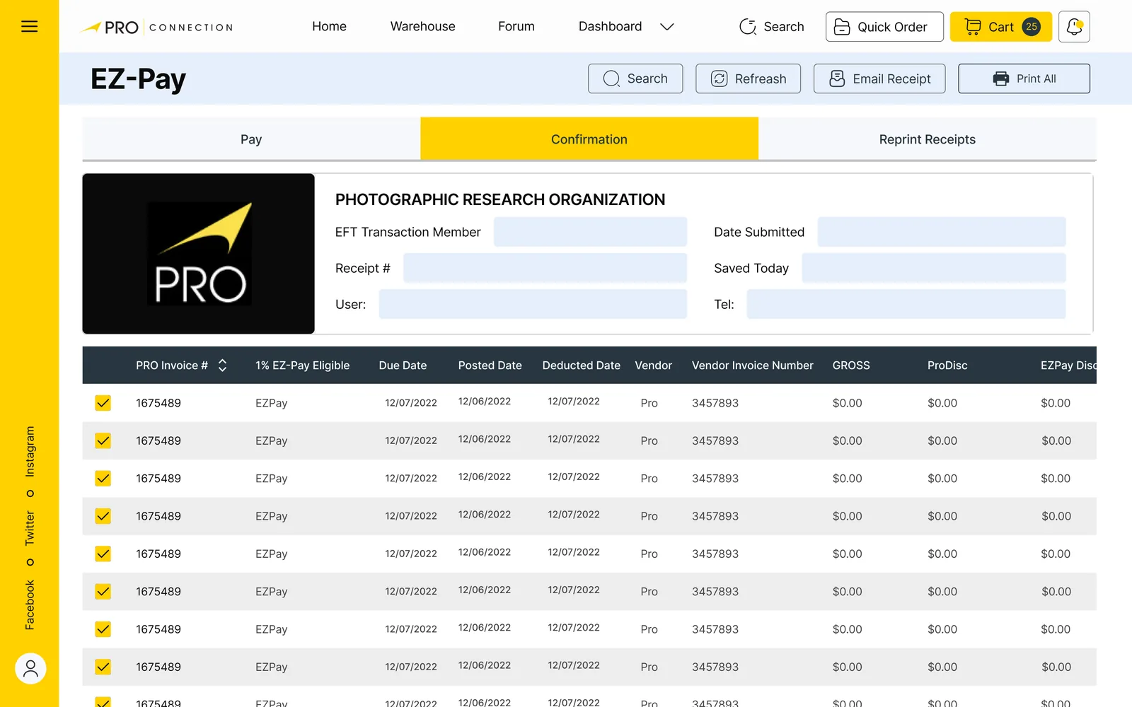
EZ-Pay: pay many invoices at once
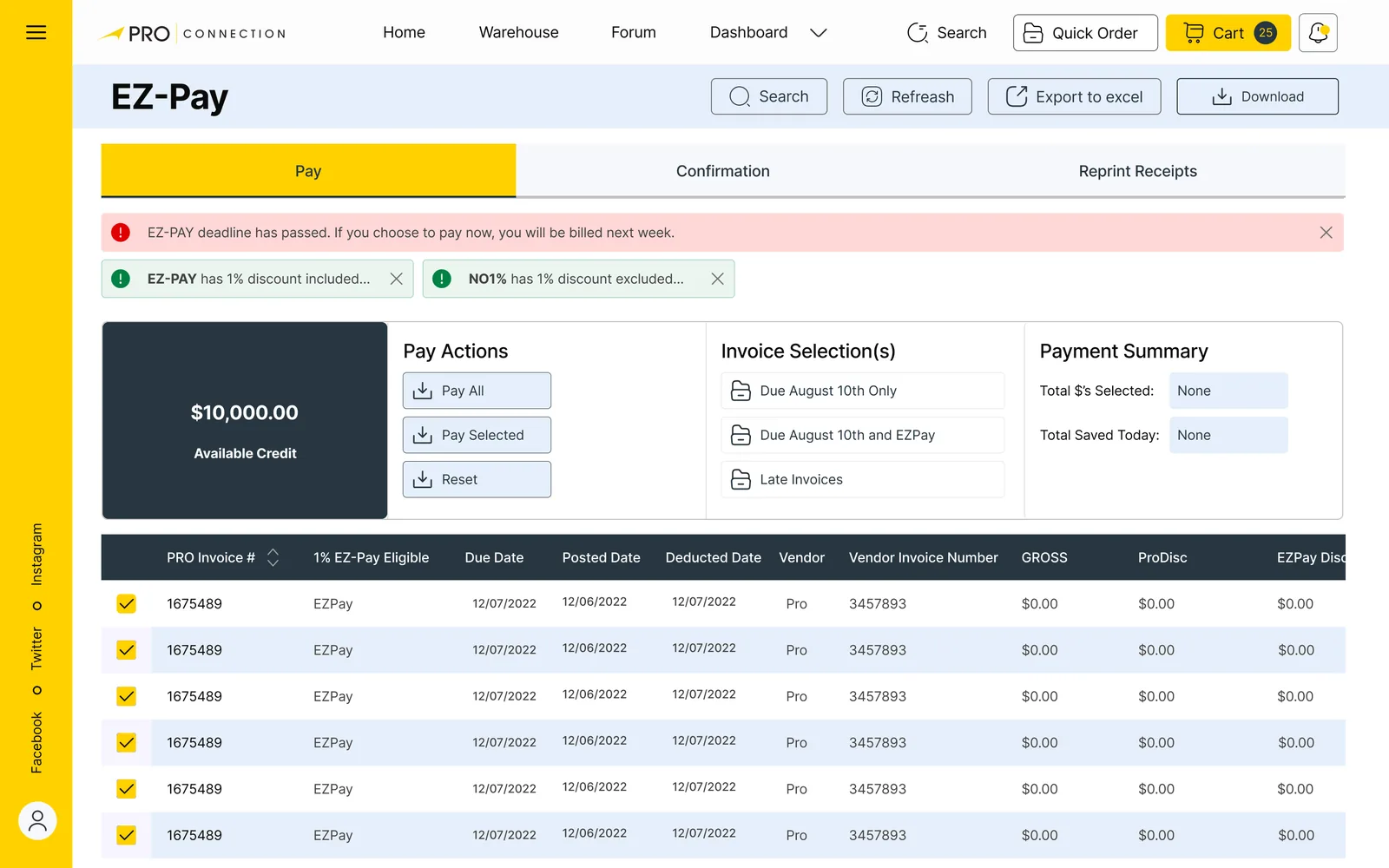
Available credit sits beside three actions (Pay All, Pay Selected, Reset), an invoice selection list with due-date groupings, and a live payment summary. A banner states the consequence of a missed deadline in plain words: “If you choose to pay now, you will be billed next week.”
WhyFinance users reconcile in batches. Selecting rows and seeing a running total, with discounts and deadlines stated up front, avoids surprises.Judgement
- 02
Tabs that follow the task
Pay, Confirmation and Reprint receipts are tabs on one screen, each with refresh, export to Excel and download.
WhyThe same people do all three in one sitting, and export is how they hand the work to accounting.Judgement
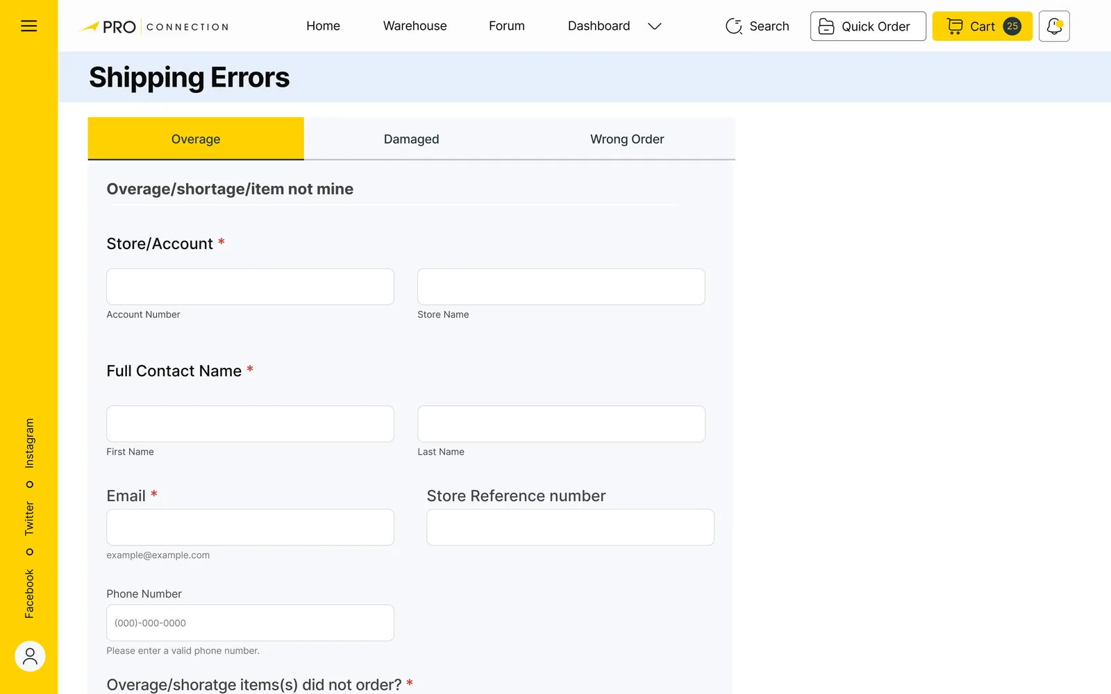
- 03
Errors as designed screens
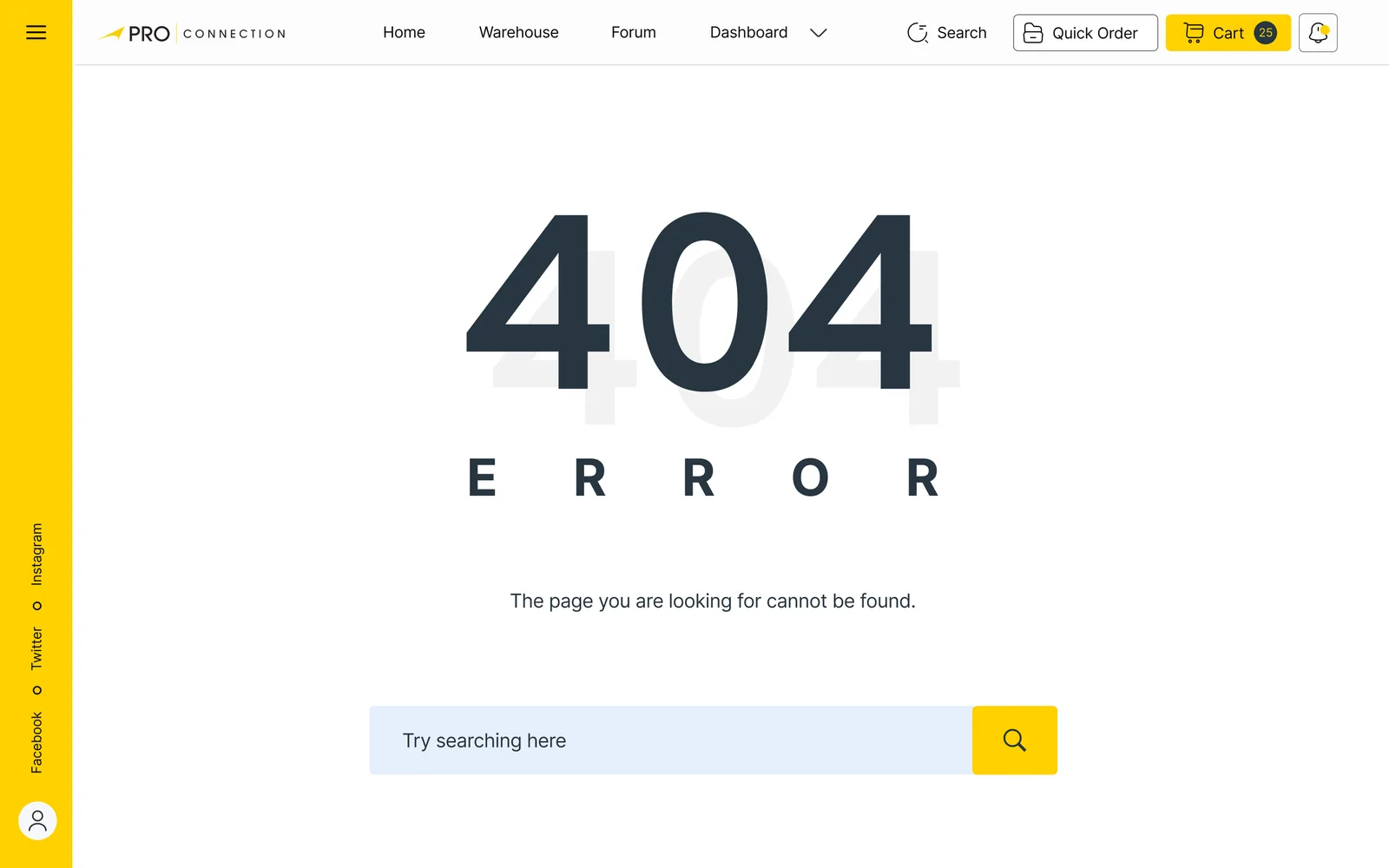
A shipping-error form for overage, damage and wrong orders; a 403 for missing permissions and a 404 with a search box, each with a clear way back.
WhyExceptions are where trust is won or lost, so they get the same care as the happy path.Judgement
08 — High fidelity
Responsive screens, from sign-in to checkout.
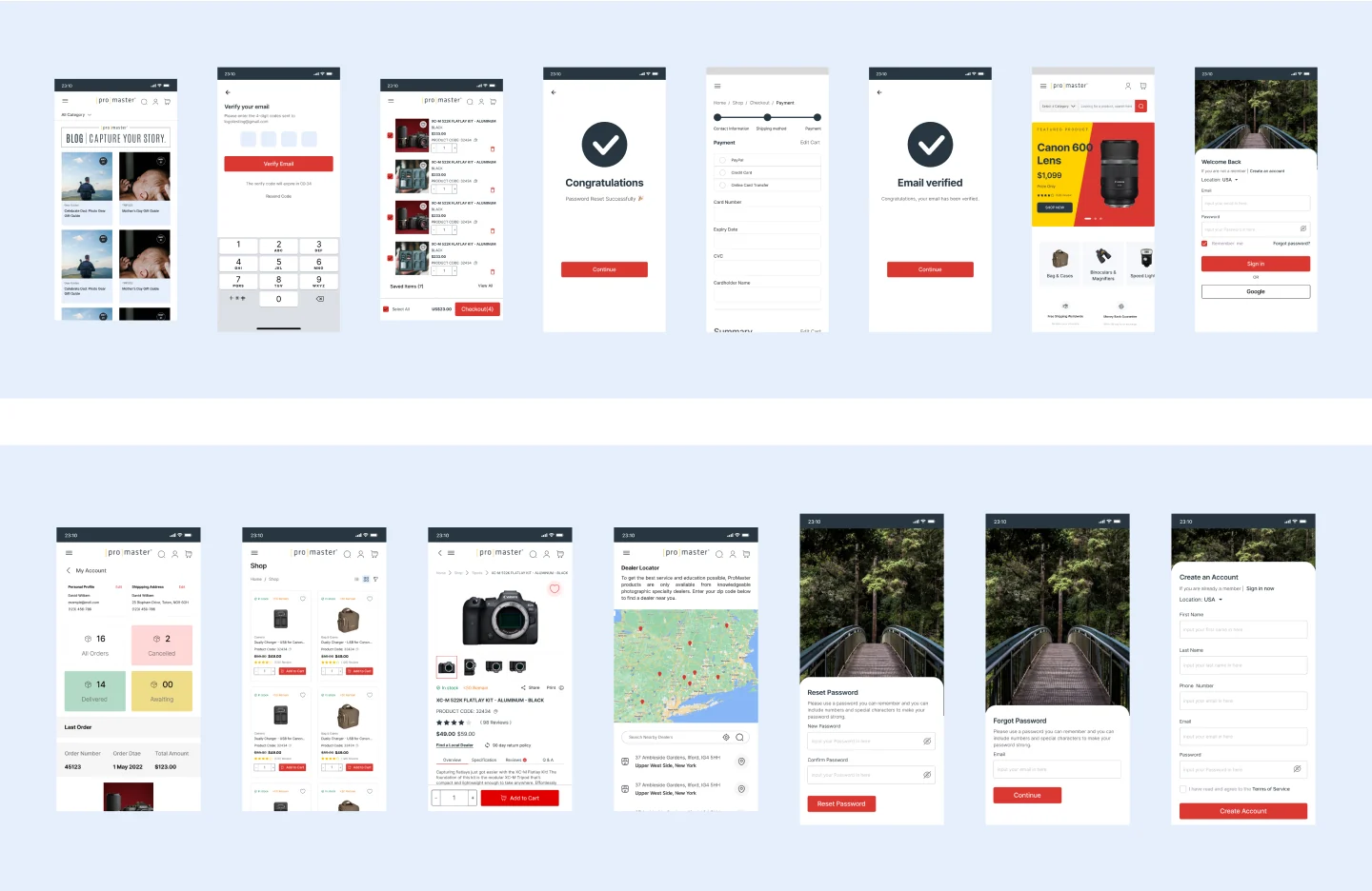
The final phase produced responsive high-fidelity screens: sign-up and email verification, the cart and payment steps, the shop and product page, the dashboard with last order, a dealer locator map, and the password flows. A shared design system kept components consistent across them.Design-level
Next step: handing the project to developers.
09 — What this doesn’t show
Said plainly.
- No outcome metrics. I don’t have conversion or time-on-task data from after launch, and I haven’t made any up.
- The research was reviews and competitors, not interviews. The persona is representative, not a real person.
- The audit labels are brief. The strongest reasoning is in the evidence chain above, and screen content such as prices and names is placeholder data.
What I’d do differently: talk to five members before designing, set a checkout-completion baseline first, and test the cart with real SKU-driven repeat orders.Judgement
10 — 2026 follow-up
Rethinking it around the reorder.
This section is new work, not the shipped client interface. Looking back, the “quick order” idea was the seed of something bigger: professionals reorder more than they browse. I rebuilt that as a working prototype in 2026.
Change quantities, switch between retail and trade pricing, then compare two lenses.
Last order · 3 items
Mirrorless body, 24 MP
$1,709.00 each
1$1,709.00Prime lens, 50 mm f/1.8
$584.00 each
2$1,168.00Spare battery
$53.00 each · add 1 more for 5% off
4$212.00
Order summary
At retail$3,433.00
Your trade total$3,089.00
You save $344.00 against retail.
Illustrative catalogue and prices.
A prototype I built to explore the idea. Its figures are examples, not client data.Design-level