← Selected work · 06 — Fit tech · Coaching app and coach dashboard
TurnKey Coach: a coaching app built around the coach’s review queue
Barbell Logic’s coaching platform, today called TurnKey Coach, is where clients log training and coaches review it. I audited the app and redesigned the client app and the coach dashboard.
- Client
- Barbell Logic, via Toptal
- Role
- Senior Product Designer
- Surfaces
- Mobile app, coach dashboard
- Product today
- TurnKey Coach
The problem
A coaching platform lives or dies on one loop: the client logs a workout, the coach reviews it. The existing app made that loop harder than it needed to be.
My role
Senior Product Designer through Toptal: usability audit, user feedback, wireframes and tested prototypes, visual redesign and a component system, in step with the developers.
The result
A redesigned client app for two phone sizes, a coach dashboard with a mobile-responsive version, and a documented design system.
This case shows real client work. The screens below are from my design file.
01 — The client
Strength coaching, run online.
Barbell Logic is an online strength-coaching and nutrition company, founded in 2016 and formerly known as Starting Strength Online Coaching. It built its own platform because third-party apps didn’t serve its coaches and clients well. That platform was the BLOC app and is now called TurnKey Coach (opens in a new tab): clients use it as their main channel with a coach and log every workout; coaches create plans, collect payments and give feedback.Public
02 — My part
Audit first, then redesign.
I audited the existing mobile app for usability, functionality and flow, gathered and analysed user feedback, then wired the findings into wireframes and prototypes tested with users. The redesign covered the look and feel (layout, colour, type and iconography aligned with the brand) and a component system, and I worked with the development team so it was built correctly, responsively and accessibly.Judgement
Role and scope as listed on my Toptal profile; the file below is the working design file.
03 — The screens
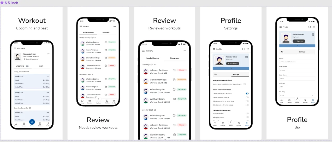
Workout, Review, Profile.
A review queue with two states
Reviews are split into “Needs review” and “Reviewed”, each with a countdown, so a coach sees what is waiting before anything else.Design-level
Status in words, not only colour
Completed, Incomplete and Missed are labelled chips, so a workout’s state doesn’t depend on telling colours apart.Design-level
One structure, every phone
The same five-tab structure is drawn at 5.5-inch and 6.5-inch sizes, on a six-column layout grid.Design-level
04 — The file
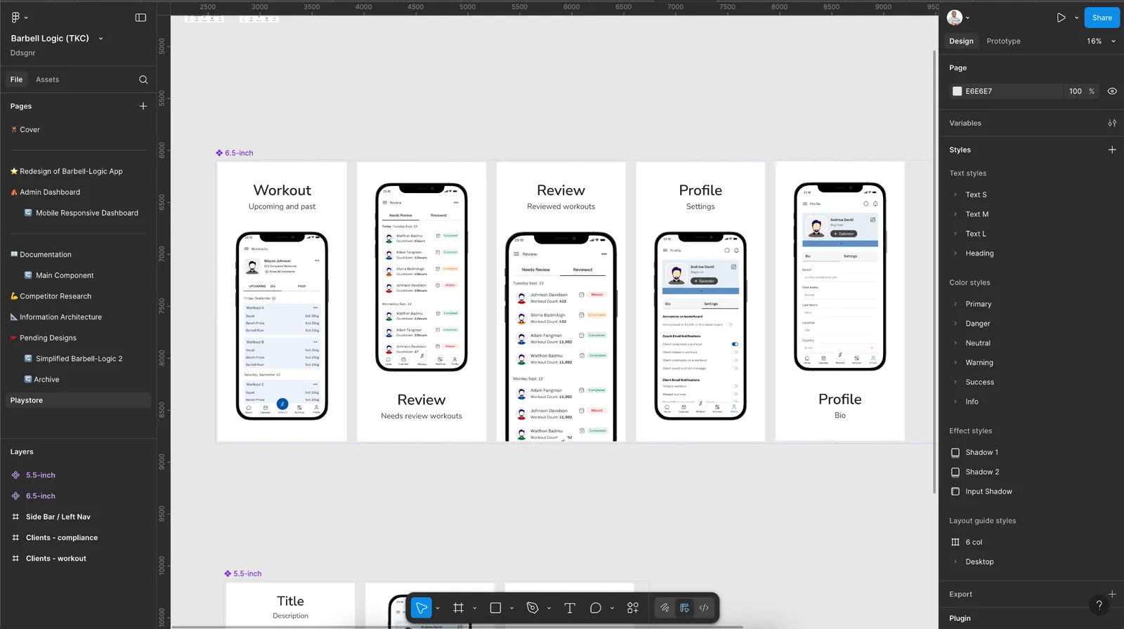
Built to be handed off.
05 — What I can stand behind
What was delivered.
- A redesigned client app for two phone sizes.Design-level
- A coach admin dashboard, with a mobile-responsive version.Design-level
- A documented component system with colour, type and effect styles.Design-level
I don’t quote engagement or retention numbers here: I don’t have measured figures I can evidence from this engagement.